Poster design
The following is a selection of my poster designs. I really like making these things by means other than a computer, so I've included plenty of that here. I've tried to include a background for each poster, along with print specs and tools used.
This is not a comprehensive portfolio, just some of my favorite poster work. To checkout a miscellany of recent work, click here. If you'd like to see additional work, discuss a potential project, or just talk posters and design, get in touch.
PI
Next up in my (unintended) disturbed protagonist series is Max Cohen, the paranoid mathematician in Darren Aronofsky’s 1998 film, Pi. The twisted plot has Max attempting to unlock universal patterns in nature with a mysterious string of numbers that lay just beyond his reach. An obsessive pursuit of the elusive number drives Max further into madness, leaving him grasping for a reality that never quite was.
Made with a copier, computer and 50,000 units of pi.
SIZE: 36"x24"

I'M STILL HERE
This year's Bigger Picture Show assignment includes another protagonist in distress. Joaquin Pheonix's 2010 mockumentary portrays the actor as a tormented, soul-searching artist on a journey to reinvent his career. Imprisoned by his own celebrity and commodified artistic output, Pheonix turns his acting career into a highly-publicized dumpster fire and retreats to music.
SIZE: 24"x36"

TAXI DRIVER
My poster for the 2016 Bigger Picture Show. This year I drew Taxi Driver, a DeNiro classic that portrays a man on the edge. The typography is from a monologue spoken during the pivotal moment in Taxi Driver, when the lead charachter, Travis (DeNiro), prepares for a final stand "against the scum" in his everyday, monotonous life.
Made with paint pen, ink, photography and computer.
SIZE: 24"x36"

HIROSHIMA MON AMOUR
This poster was created for the 5th annual Bigger Picture Show, a poster exhibition and silent auction benefiting the Indy Film Fest. I was assigned the french new-wave classic Hiroshima Mon Amour, which deals with the juxtaposition of love/memory and the Hiroshima bombing. A great movie all-around.
Made with brush, ink, photography and computer.
SIZE: 24"x36"

THE MOUNTAINTOP
One of my favorite clients has been the Indiana Repertory Theater. Working for a great theater is a designer's dream, and I'm excited to continue the relationship.
I created this poster/identity for IRT's production of The Mountaintop, a fictionalized account of MLK's last night on earth. Set entirely in room 306 at the Lorraine Hotel, there's a ghostly, metaphysical element to the story, and the situation forces King to confront his own vices.
Made with photography, copy machine and computer.
SIZE: 24"x36"

AND THEN THEY
CAME FOR ME
A poster for the Indianapolis Repertory Theater. The play was an unconventional Holocaust piece, and featured a small cast alongside filmed conversations with Holocaust survivors.
Due to timing and a few other chance circumstances, this one was never used. Either way, I feel it's worth sharing. Plus I printed a few myself.
Made with marker, scissors, paper, photography, and computer.
SIZE: 24"x36"

THE CRUCIBLE
Another poster for the Indiana Repertory Theater, this time for Arthur Miller's The Crucible. The design plays on a literal translation of the title, the theocratic aspect of Salem culture and the general dissent of a hysterical community.
For the artwork, I cut the elements from paper, manipulated the pieces with pushpins, and photographed the results, including shadows. Made with scissors, paper, photography, paint marker and computer.
PRINT: silkscreen, three-color
SIZE: 25"x38"

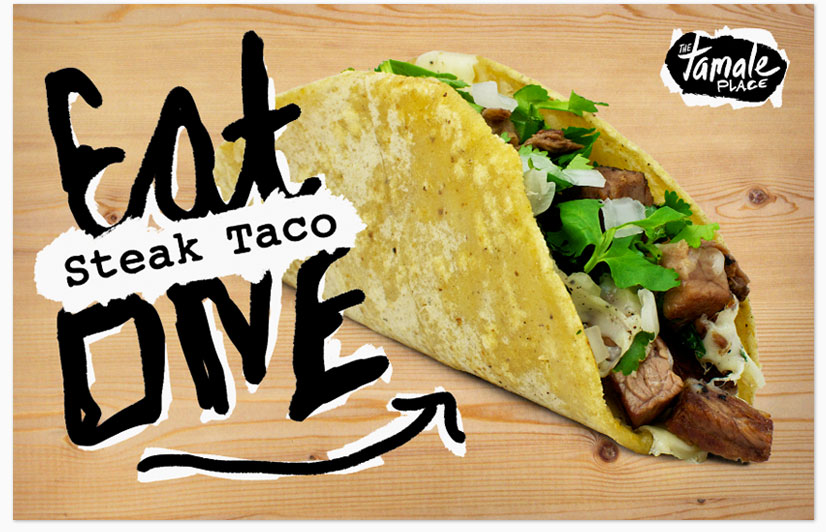
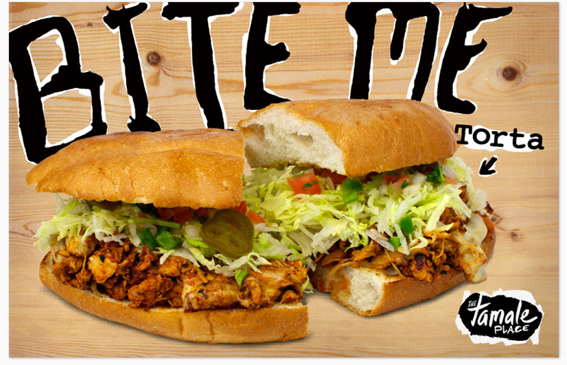
THE TAMALE PLACE (plywood)
A large part of the Tamale Place rebrand was designing the interior of the restaurant. Capitalizing on the same tongue-in-check approach mentioned above, we set-out to make some large, prominent signage highlighting the tasty offerings at TTP. Why not a poster?
Made with brush, ink, paint marker, photography and computer. Printed on plywood.
PRINT: flatbed inkjet, five-color
SIZE: 46"x30"


ELECTION '12 – WOMEN'S RIGHTS
This was a self-initiated poster for the 2012 Presidential Election. The goal was to highlight the questionable Romney/Ryan stance on women's rights, specifically rape and abortion. The copy was taken directly from a quote by Paul Ryan, suggesting rape as 'just another form of conception.' Sometimes an ugly topic requires an ugly poster.
Made with brush marker, felt-tip pen, copy machine and computer.
PRINT: silkscreen, one-color
SIZE: 28"x40"

PENROD ARTS FAIR '12
We've had the pleasure of designing the identity for the Penrod Arts Fair three times. For 2012, the theme was color, motion and 'mashup.' This final poster in the advertising lineup served as a perfect culmination of all three.
For the production, I was especially interested in layering, and each color was overprinted on top of another. Made with brush, ink and computer.
PRINT: silkscreen, four-color
SIZE: 34"x22.375"
